Why are webcams so cursed?
Reviewers say the camera on Apple's new display is horrible. Not surprised, tbh.
Last week, Apple announced their first new mainstream computer monitor in more than a decade. The new Apple Studio Display is not the most impressive monitor, but with a 5K, wide-gamut color panel it’s pretty good. The new Studio also doesn’t have a full docking solution, in that it has 3 USB-C ports which will still require dongles, but at least the dongles can stay on your desk and be hidden out of sight.

This brings me to the webcam and speakers, especially the camera, which really ought to be its killer feature. We all need good cameras more than we used to, and because Apple is generally very good at getting attractive images out of tiny cameras.
Which is why it’s such a shock that early reviews say the Studio Display’s webcam is not only unimpressive — it’s actively bad.
Joanna Stern, The Wall Street Journal:
You can understand why I anticipated that the Studio Display’s webcam would be the GOAT (Greatest of All Time). Yet Apple’s camera consistently produced grainy and washed-out images. There was so much missing detail in some of the shots that it reminded me of the camera on my old BlackBerry. On the plus side: No one could see my frizzy hair.
Apple has a long history of producing amazing images with 12-megapixel sensors and A-series chips, and for some reason, this thing just looks awful.
Actually, it looks awful in good light and downright miserable in low light. I’ve tried it connected to the Mac Studio and on my MacBook Pro running macOS 12.3, and on both machines, it produces a grainy, noisy image with virtually no detail. Turning off the Center Stage feature that follows you around the room doesn’t help. Turning portrait mode on and off doesn’t help.
John Gruber, who you’d expect to find some way to call an Apple product industry-leading if at all possible:
Is the Studio Display camera unusable? No. I suppose it’s at least as good as the image quality from the camera on Apple silicon MacBooks. But that’s a low bar. How can the image quality from the camera on a $1600 display be so much worse — laughably worse — than the image quality from a $600 iPad Air that uses the exact same camera hardware? Let alone comparing it to the front-facing camera on the $430 iPhone SE, which makes the Studio Display camera look like a toy. And we waited years for Apple to ship this display.
…Multiple little birdies familiar with the Studio Display, each birdie independent of the others, tell me that the image quality problems really are a software problem, not hardware — a bug introduced at the last minute — and a future software update might not merely somewhat improve image quality, but raise it to a level commensurate with the iPad models equipped with the same camera.
It’s great that the badness is likely to be fixed in a software update, but my disappointment started even before the reviews came out, when Apple said they’d equipped this fancy new display with the same camera system as the iPad. I feel Apple has missed an opportunity to make a truly great, innovative webcam, and instead settled for just being the best in a crappy field.
Last year in a post for Reincubate —makers of Camo, an app that turns iPhones into excellent webcams — Jeff Carlson looked at several leading webcams and found that they’re all terrible:
Uneven color. Blown highlights. Smudgy detail, especially in low light. Any affordable webcam (even at the high end of affordability, $100+), uses inadequate and typically years-old hardware backed by mediocre software that literally makes you look bad. You might not notice this if you’re using video software that makes your own image small, but it will be obvious to other people on the call.

After two years of seeing co-workers mainly through grainy, poorly lit, often glitchy Zoom, Teams, or Google Meet video calls, we all want — nay, deserve — computer cameras that will make us look good.
Some of us have invested serious money and time in this. How many people have become “streamers” over the last year, with studio lights, fancy microphones on boom arms, and DSLR cameras hooked up to capture cards, only for their main “streams” to be work calls? This has led to a real haves vs have-nots situation where picky people with disposable income get to look like themselves at work, and others get to look like an impressionist painting.
The startup Opal has attracted lots of attention (not to mention people clamoring to give them $300) for their still-in-beta, invite-only webcam, which combines premium components (a big 4K sensor; an f/1.8, wide-angle lens) with smart software to produce video that looks like it came from a DSLR, at a fraction of the cost. (The Verge, Input, and Minimal Goods all have good hands-on reviews of the Opal.)

The look of Opal footage reflects a choice about the kind of camera they wanted to emulate: a $2,000 full-frame mirrorless camera, with a nice wide-open lens that produces the attractive, subtle optical blurring effect called bokeh. Opal’s Mac app can add bokeh to your image, just like Apple’s Portrait Mode, and also gives the user control over settings like exposure and color saturation, just the sort of thing someone would want if their ideal was basically a simpler, cheaper Canon EOS R.
“Good” is subjective, of course. Opal has pegged “good” as images that look like they were shot by a tasteful professional with high-end gear, which is probably the right move for a product that’s being marketed as a great solution for conferences and business meetings.
Apple’s definition of “good” is more controversial. In Apple’s phone cameras, the ideal isn’t just a clean photograph or video feed — it’s a fully processed (even over-processed) image, as Kyle Chayka discussed in his New Yorker piece about the iPhone cameras:
On the 12 Pro, the digital manipulations are aggressive and unsolicited. One expects a person’s face in front of a sunlit window to appear darkened, for instance, since a traditional camera lens, like the human eye, can only let light in through a single aperture size in a given instant. But on my iPhone 12 Pro even a backlit face appears strangely illuminated. …
Gregory Gentert, a friend who is a fine-art photographer in Brooklyn, told me, “I’ve tried to photograph on the iPhone when light gets bluish around the end of the day, but the iPhone will try to correct that sort of thing.” A dusky purple gets edited, and in the process erased, because the hue is evaluated as undesirable, as a flaw instead of a feature. The device “sees the things I’m trying to photograph as a problem to solve,” he added.
The qualities Apple cameras optimize for, like rich colors and clear, bright faces, are generally good things to have in a photograph, and definitely what you’d want in a webcam image. And I truly think Apple applies such aggressive processing because most of the time it results in pictures people really like.
The problem is that Apple applies this processing indiscriminately and too much. Their smart cameras have no concept of “natural,” and the Apple engineers that programmed them seem to love showy HDR photos so much that they taught our phone cameras to eradicate all shadows.
Here is me, on my couch, with the laptop camera on my M1 Max MacBook Pro (which is probably close to what one can expect from the Studio Display):

Is this fine? I mean, yeah, this could be a lot worse. But the cloudy daylight in the windows is throwing off the color balance, making anything lit by indoor LED light (like me) look orange or pink. The camera is doing its best to bring out details in my face, but in doing so it’s making me look flattened.
This is a bad scene, and it seems crazy to expect any laptop or tablet camera to make it look good. But I’d love for Apple to try! Yet it seems like, given an opportunity to shift all of our expectations for home office webcams, Apple is content to just deliver a camera that is merely less terrible.
My judgment here is based not on the Studio Display camera’s awful (and likely temporary) current performance, but on Apple’s marketing for it, which emphasizes Center Stage (Apple’s gimmicky, annoying auto-centering tech) as the killer feature, as if people walking in and out of frame at your desk and not being perfectly composed is a problem any of us have had in the last 2 years, or ever.

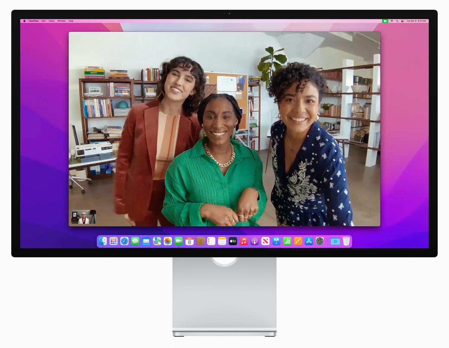
Even in this marketing shot which should show the camera at its best, the images seem… dull. This shows a scene with bright, diffuse light, plants, books, brightly colored fabrics and beautiful, rich skin tones. This image should pop. Instead, it looks merely okay. It doesn’t even seem all that crisp or clear; the woman’s face on the right looks almost as fuzzy as if she were being filmed by a $99 Logitech camera, not a $1,600 smart display.
If Apple can be credited for anything in this picture, it’s honesty. This image looks a lot like the bland, flat picture from my MacBook webcam, which tells me this is probably what we can expect from the Studio Display once the launch bugs are fixed. And this is better than nothing, which is what we’ve had from Apple displays for the last eight years.
But I was hoping to be able to put away my elaborate Sony ZV-1 streamer setup and stop dreaming about someday getting an Opal, because Apple would have done something interesting here. It saddens me that they didn’t. I’m still getting a Studio Display — the screen and speakers do sound as impressive as I hoped — but I’ll be keeping my standalone camera around too.